Vista called and wants it’s ugly back
Liquid Ass


These guys spend a billion dollars every couple years to invent the lock screen again
Gives me iOS 7 vibes.
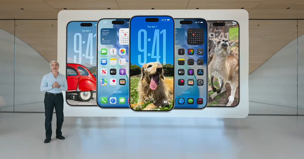
I like it in theory, but in some of the examples they provided on https://www.apple.com/newsroom/2025/06/apple-introduces-a-delightful-and-elegant-new-software-design/, reading text isn’t the easiest with all the colors and blurs everywhere.
Also not a fan of the critical UI elements being popped out into floating islands, very easy to accidentally hit underlying page content when there’s effectively zero padding around controls (on touch devices, as the ad companies have discovered by making the × icons smaller and smaller).
Wow, that is bad. The music one is probably the worst of the examples. The artist name is barely readable most of that clip.
The notifications are rough too, a big wall of white text against a burry multicolor background is not fun to read.
deleted by creator
hey I had that winterboard theme like 15 years ago
Using the developer beta and my phone runs quite hot. Of course, it’s a beta so they’ll probably reduce the effects to make it less of drain on performance and battery life. There is a reduce transparency toggle which does help a bit, esp. for readability. Hopefully when iOS 26 is released there’s an obvious option to reduce transparency.
My opinion on the “liquid glass” is mixed. Some parts look pretty cool. The apps (Mail, Photos, etc.) use it quite well, with only some parts are transparent making readability a bit better. I really like the change to the search bars being at the bottom, makes the phone more one-handable. Safari doesn’t look too good in my opinion, the glass effects are a bit much. The camera app just hid all the buttons, which is a bit annoying. You can have it show flash and live photos toggles in settings, which is good.
The lock screen effect with the “3d” photos is very cool, but the phone runs extra hot when it’s enabled so I turned that off. The glassy clock is pretty cool and there’s the option to make it normal again if you select “solid”. Swiping up from the lock screen makes a weird glass effect with the edges distorted and lots of rainbow fringing, which looks a bit odd. When you swipe down you can see the home screen app icons until it’s all the way down, then they all pop out of existence and the background is replaced. Bit jarring. Similar effect with swiping up, background changes with no transition, but the apps appear in an animation this time. Weird. I’m assuming this is probably a bug with the beta, at least I hope it is…
Onto the home screen. I think the “liquid glass” themes make the tinted icons look a bit better than just colour on black, I like that bit of customisability. I still do not get the “clear” icons, it quite literally is transparent and you can barely differentiate the icons. You can always swap it to the default, but there is still some annoying glass effects on app icons where it clearly isn’t natively built (I’m guessing the glass effects is applied to all icons automatically incl. third party apps, but it doesn’t look too great with some of them). The app folders look terrible though and the reflection/refraction is really distracting. The pop ups when you select text is especially annoying, popping up a huge bubble. I’ll need some time to get used to that vs just clicking right to share, translate, etc. The control center is not very nice to look at but it works fine.
Overall, in places where it’s used tastefully (in a lot of Apple’s apps, for instance) it works quite well if a bit distracting. I like the lock screen and home screen customisation and the ability to change it to “solid”. The glass effects are still quite distracting though. The reduce transparency toggle does help a bit with readability, but it’s annoying that it’s buried deep in accessibility settings. Not very accessible at all. The lock screen 3d effect is cool but is a bit subtle, and it makes the phone uncomfortably hot. There are still plenty of bugs, but that’ll hopefully be fixed in the public release. I like the option for the tinted icons but do not get the clear icons. Camera app isn’t too functional, just hiding everything isn’t better than before! The iOS 26 beta is quite fun, if very buggy, and the liquid glass works in some places but doesn’t work in all places.
This makes me want to get rid of my iPhone even more
I need to buy three immediately!
Android and ios are basically indistinguishable to me at this point